New AdWords Interface Design Rolls Out
[x_author title=”About the Author”]
Google Redesigns AdWords Interface
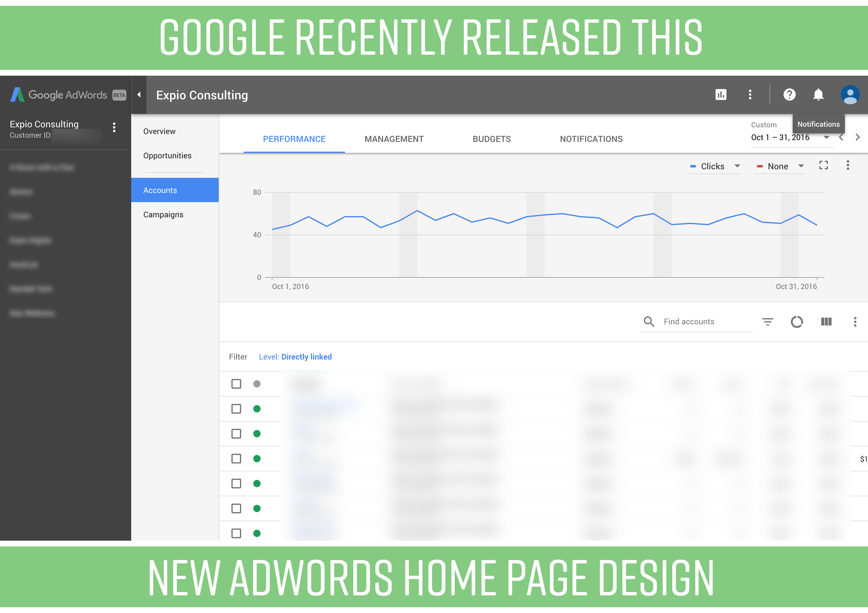
The much-improved interface from AdWords came out to users last Wednesday. We think it’s a big improvement over the previous design. Though, there are some bugs we’ve noticed, like text being cut off in certain spaces. But we’re sure they’ll correct those quickly.
The look and feel is much cleaner and easier to navigate. We’ve found the new organization to be much more intuitive, easier to find where we want to go. That’s probably the biggest change – how the new interface organizes the navigation.
If you’re managing multiple accounts, the new design makes navigating between accounts a little less difficult.
The addition of more color, and shading provides nice clarity between all the features you’re used to seeing in those dull white and black-bordered boxes. Text seems bigger and easier to read.
New Design

 Previous Design


What do you think of the change?


 Previous Design


Leave a Reply